Monday, May 20, 2013

It's Me

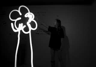
Photography is my little form of creation. I put my heart and soul into my images and although I am rarely the subject, I am always in my photographs. Yet I am also always behind the camera. I, like many, build walls to hide behind. But this is a self portrait. Here, I am revealing myself, breaking down my own wall, and showing you what is important to me and what I consider to be part of my identity. These are my hands, the tools I use to craft my art are art themselves. I am proud to express myself through my photography and expose to you what lies behind my wall.


Sally Mann

This is the second set of my Sally Mann images. I again aimed to capture the raw beauty of my models like Mann did in her portfolios that I studied. 

I’d like to thank my models for working with me on this project. During this shoot, it was drizzling and I had to shoot from underneath a towel to keep the camera dry. But the drizzle really enhanced the naturalness of the lighting and the texture of my images so I’m grateful for that. On a less grateful note, we also had to jump in the trunk of my car during this shoot to avoid the geese that were chasing us through the park...

If Sally Mann ever happens to come across these images, I hope she appreciates my work and I hope that I've done justice to her art because she has definitely inspired me!


Saturday, May 18, 2013

Sally Mann

These photos are all part of an assignment for which I was to choose a photographer to emulate. I chose to emulate Sally Mann. Even though many critics have criticized her work as it can often seem disturbing and/or controversial, I love the quality of her photography and I think that her work is stunning aesthetically and on a deeper level. Mann often uses her children as her models and, in her portfolios that I studied, she focuses on adolescents and their raw beauty. With my images, I tried to capture that raw beauty by placing my subjects in natural environments and using natural lighting.

For this assignment, I used a large format film camera, similar to one Mann used, and focused on shooting young girls like Mann did in her second collection published in 1988 titled At Twelve: Portraits of Young Women and like she did in her third collection, Immediate Family, published in 1992 with images of her children. These are the first six images I did for this collection and there are more to come. I hope you like these images as much as I liked making them.


Friday, May 17, 2013

TIme Exposure: Balls in Motion

This image is a part of my time exposure assignment. It was hard to get this shot to work the way I wanted it to because it wasn't dark in the room so I couldn't leave the shutter open for a very long time or it would be over-exposed. So I just had somebody break the pool balls and I pressed the cable release for probably half a second or a second maybe. I love how this image turned out because all of the balls are blurred in motion except for the one orange ball in the middle which draws your focus. I love seeing all of the motion because you can even see how each ball rolled with all of the spiraling colors. I hope you enjoy it as much as I do!


Time Exposure: Ablaze

This is another one of my time exposure images. Again I used the flashlight with the camera on bulb and on a tripod with the cable release. I kept this photo in color and added a little bit of a yellow hue just to make the original red color look more orange. I like this photo because I think it is interesting to see the two stick figures along side a real person because it contrasts fantasy and reality. Hope you like it too!

Time Exposure: Neon Trees

This photo is also a part of my time exposure assignment. I did the same thing for this shot in regard to the cable release and the flashlight. The photo originally had a red tint to it but I edited in photoshop to make it black and white. I think that the image is clearer and simpler in black and white which I like. Enjoy!


Time Exposure: butterfLIGHT

This photo is part of my time exposure assignment. The room was completely dark and I had a flashlight with a red piece of paper over it to make the image have some color. I set the camera on bulb and set it on a tripod and pressed the cable release so that the shutter would stay open until I pressed it again to close the shutter. Then I went behind the person in the picture and drew wings with the flashlight pointing towards the camera. Then in photoshop I increased the magenta hue to make the image have more of a pink tint to it. Hope you like it!


Wednesday, March 13, 2013

Complimentary Colors: Bouquet from a Bird's Eye View


This is the same bouquet that was in the previous photo in my complimentary color assignment. I again used the same LED lighting and white backdrop. I like how the backdrop is a little wrinkled underneath the vase so that the light creates shadows underneath it. The angle works really well with the subject because it fits beautifully in the frame. I used a 5.0 F-stop to make the flowers in focus while the vase is faded. I also used the rule of thirds in this image because the flowers are in the top third of the frame. I love this photograph because it is very well composed. Hope you like it too!


Tuesday, March 12, 2013

Complimentary Colors: Bouquet


I used this photo for my complimentary colors assignment. The fire-like reds and oranges in the flowers look beautiful with the soft blues in the vase. I used the white backdrop again to make the colors pop. The artificial lighting in this image is actually behind the vase which creates the lighting in the petals on the edge of the bouquet while the rest of the flowers and the vase is shadowed more. I used a 5.6 F-stop to make most of the flowers in focus while the vase is mainly out of focus. I like the composition of this image because it graduates from dark to light with the rule of thirds as each vertical third of the page from right to left gets lighter. Also, I took the shot from an angle almost below the flowers in the vase which makes it more interesting. Enjoy!


Complimentary Colors: Smiley


This is a part of my complimentary color assignment. The bright yellow cup compliments the dark violet color of the background. I used artificial lighting from my LED light to create the shadow that hugs the edge of the cup. This image follows the rule of thirds because most of the cup is in the right third of the image while the other space is emptier. I love how the smooth glossy surface on the cup looks with the very textured background. This photo has a very happy mood too from the cute smily face which makes it fun to look at! Hope you think so too!


Complimentary Colors: Sprouts


This is another image in my complimentary colors assignment. Pink and green are complimentary colors because, like blue and red, one is cool while the other is warm and they are on opposite sides of the color wheel. I used artificial lighting to make the nice shadows that you can see coming from the side of the cup. I set up my white backdrop for this shot to make the colors pop more. I also used a 5.0 F-stop to make the sprouts and the rim of the cup in focus while the rest of it is faded into the back. I like the depth that the image has as a result of it being vertical and because of the F-stop. Enjoy!

Monday, March 11, 2013

Complimentary Colors: Blueberries


This image is a part of my complimentary color assignment. Blue and red work well together because blue is a cool color while red is a warm color and they are near opposites on the color wheel. The blue blueberries with the purple tones look really good against the bright red glass that hold them. I used artificial lighting with my LED light which also lit up the water droplets on the berries. I used a 5.0 F-stop to make the blueberry in the middle be the center of attention. The 5.0 F-stop also made the glass fade into the bottom of the image while it is crisper on the rim. Hope you like it!


Thursday, March 7, 2013

Light and Shadow: Divine Vines


This photograph is for my light and shadow assignment. I took this picture at about o'clock in the afternoon which I usually think is a terrible time to shoot if you are using natural light. But I love the way that the light shines through these leaves. I love the glare in the bottom right corner from the light. And I love how the light shines through the leaf so that you can see the beautiful green color and all of the details in the veins of the leaf. I set the camera on about a 5.6 F-stop which creates the main focus on the leaf in the center while the other are more blurred. This image is beautiful to look at as it almost looks "heavenly" because of the natural back-lighting. Enjoy!


Light and Shadow: OverBEARing Shadows


I took this picture for my light and shadow assignment. I was just looking around my house for interesting shadows to capture and I noticed the pattern that the shutters put on the wall. The giant teddy bear was in the corner by the lit wall too. I took the picture from an angle where the light would be projected downward across the bear to make the image more interesting to look at. I used all natural light too. I like how the image is monochromatic. It is a sort of sad looking picture since the bear it slouched over in selective lighting, but I still like to look at it! Hope you do too!


Light and Shadow: Budding Guitar


I took this photograph for my light and shadow assignment. I used my LED light to light the guitar and the flowers in it. I used a 5.0 F-stop to get the shallow depth of field that makes the pink daisy in focus while the guitar and the other flowers are out of focus. I love the complimentary colors between between the pink flowers and the blue walls too. Enjoy!


Light and Shadow: Self Portrait


This picture is from my light and shadow assignment. I used a mirror to get a reflection of myself taking the picture. The light is harsh because I used my LED light on a bright setting and it was very close to my face. Then I adjusted the F-stop and shutter settings on my camera to match the lighting on my face. To get my face under the right lighting, I had to over-expose the whole image which made the rest of it really dark which adds a nice contrast to the picture. Hope you like it!